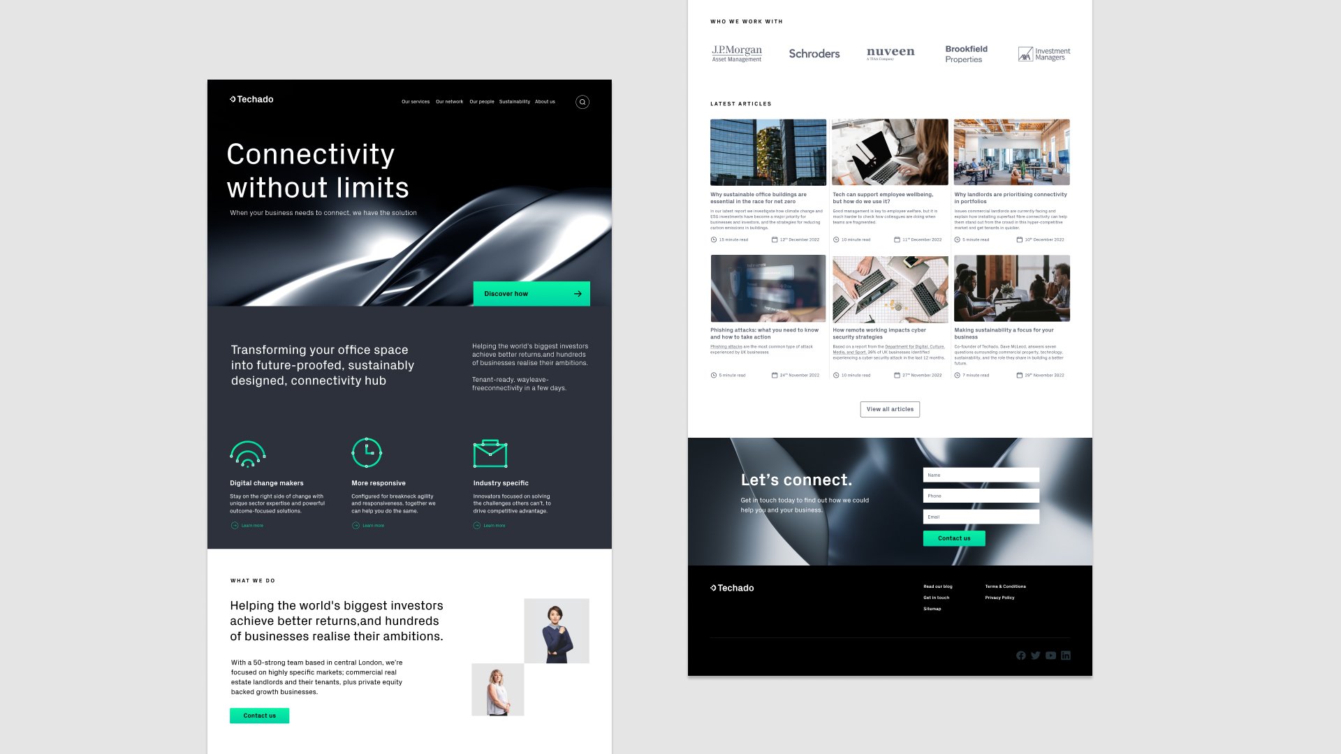
Techado is a company that provides services and products that solve the challenges of sectors such as commercial real estate companies and private equity backed businesses to optimise their agility and maximise their investments.
The Brief
To update the existing brand so that it better aligned with the company’s core values while feeling modern, innovative and
eye-catching.
The Solution
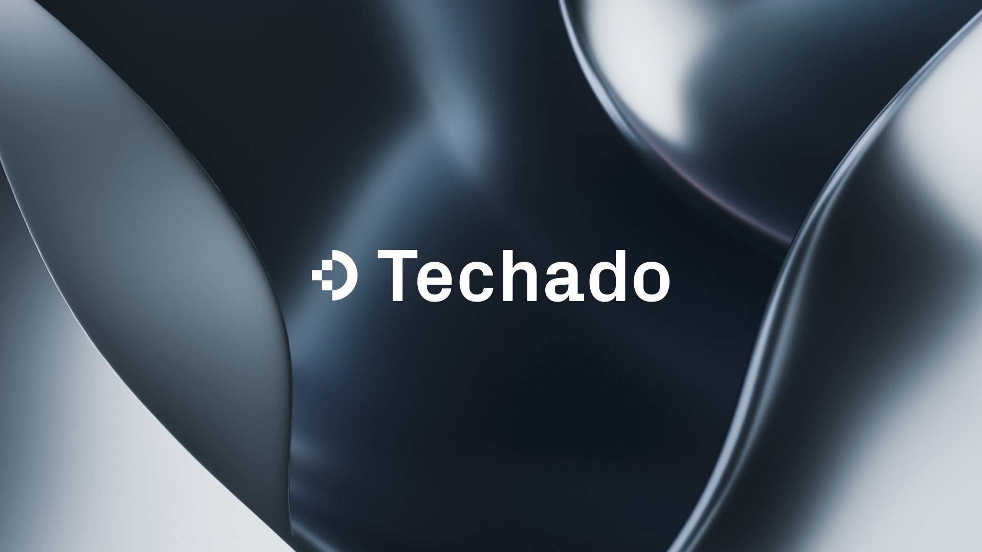
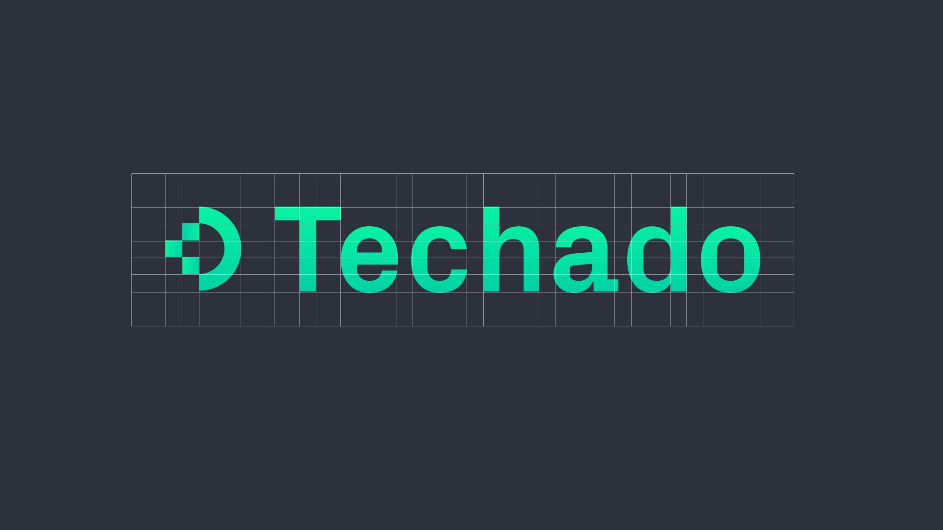
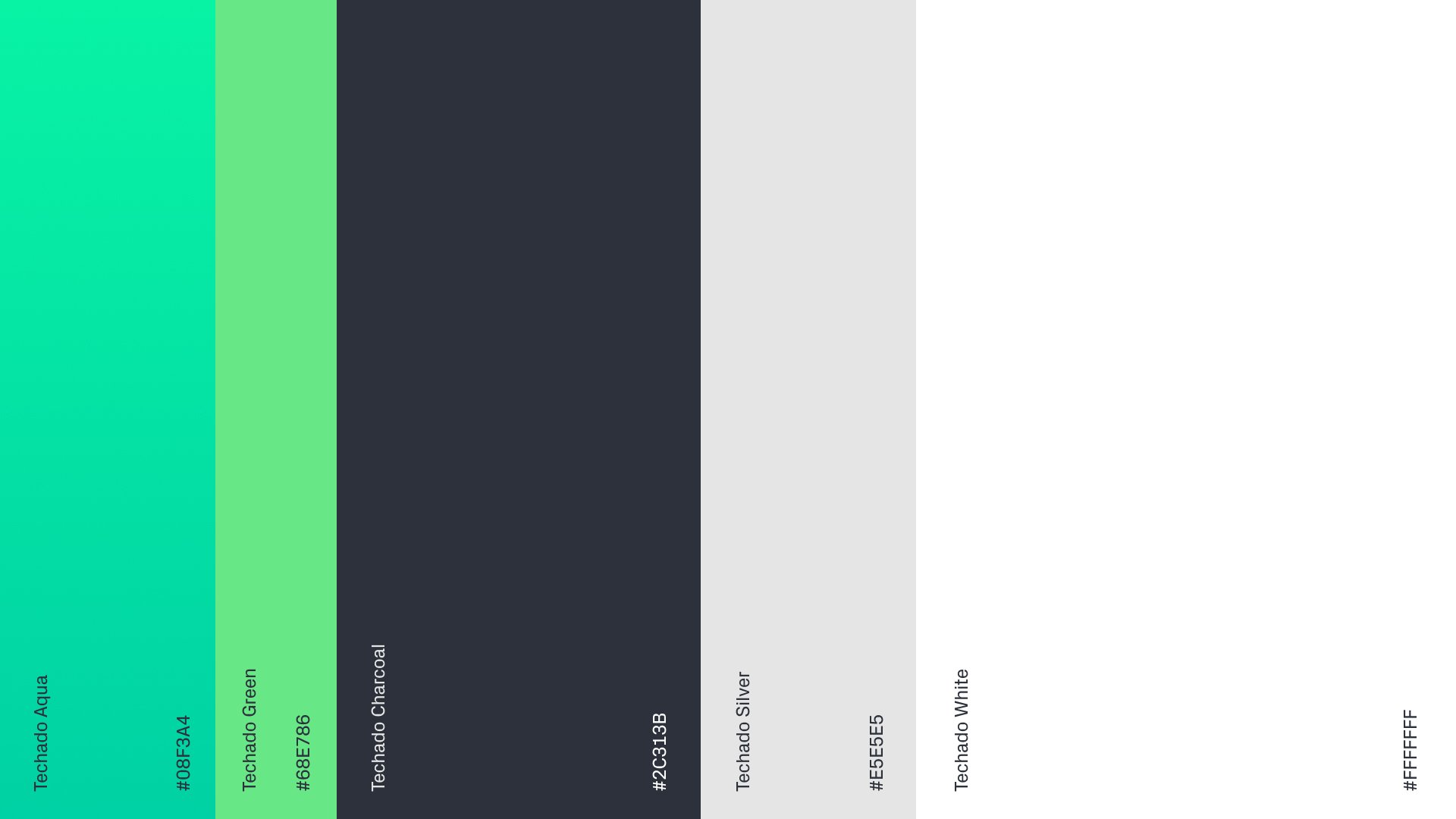
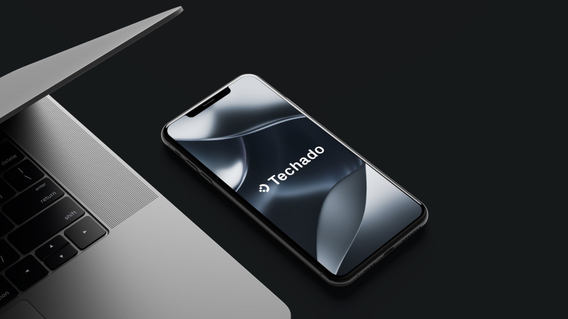
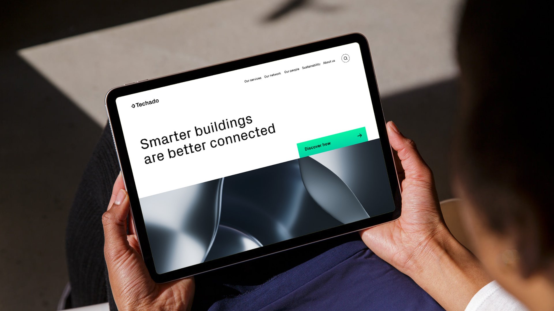
Balancing human connection and technology, the palette is monochromatic with pops of bright neon chosen for their luminous quality in the digital world. Similarly, the typeface chosen for the logo and brand uses rounded edges and corners to also reference the idea of human and technology in harmony. The abstract imagery references architecture in materiality and is balanced soft flowing forms. The overall brand is professional, minimal and forward-thinking.
corporate rebrand for a fast growing tech business